 |
What QSRs Can Learn About Identity from the Cracker Barrel Misstep
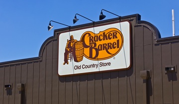
Cracker Barrel’s new logo and visual identity was supposed to signal modernization, but instead, the world saw a brand that had traded eccentricity for sameness. A restaurant that once owned cozy, maximalist Americana is now dressed up like an HGTV farmhouse. It’s safe. It’s beige. It’s boring.
Source: QSR Magazine
View / Download
|
